The Design Challenge: Strategic Brand Refresh
The objective was to revitalise Bio-Kult's visual presence to better connect with a broader, primarily female consumer demographic, moving away from its existing masculine and clinical aesthetic.
Goal: To inject a sense of natural vitality, approachability, and femininity into the brand identity.
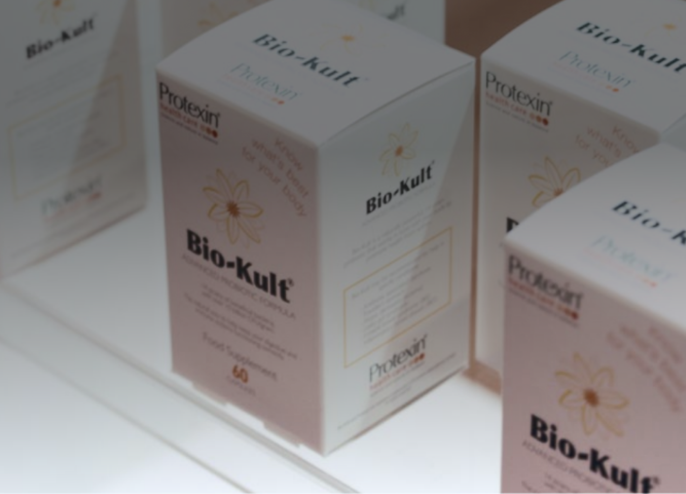
Constraint: Crucially, the Echinacea flower was a significant element of the existing brand recognition and needed to be retained but graphically refined to align with the new, softer visual direction.
Product Excellence:
The brand maintains a strong foundation of scientific credibility, offering award-winning supplements with a unique combination of live bacteria, vitamins, and minerals designed for optimal gut health. The new design needed to visually communicate this efficacy without sacrificing approachability.
Design Process & Deliverables
Working in close partnership with the Bio-Kult team and Head of Marketing, I drove the design strategy and execution across the brand ecosystem.
1. Visual Identity Refinement:
I established a fresh, contemporary visual language, characterised by a refined color palette, modernised typography, and a new graphic style.
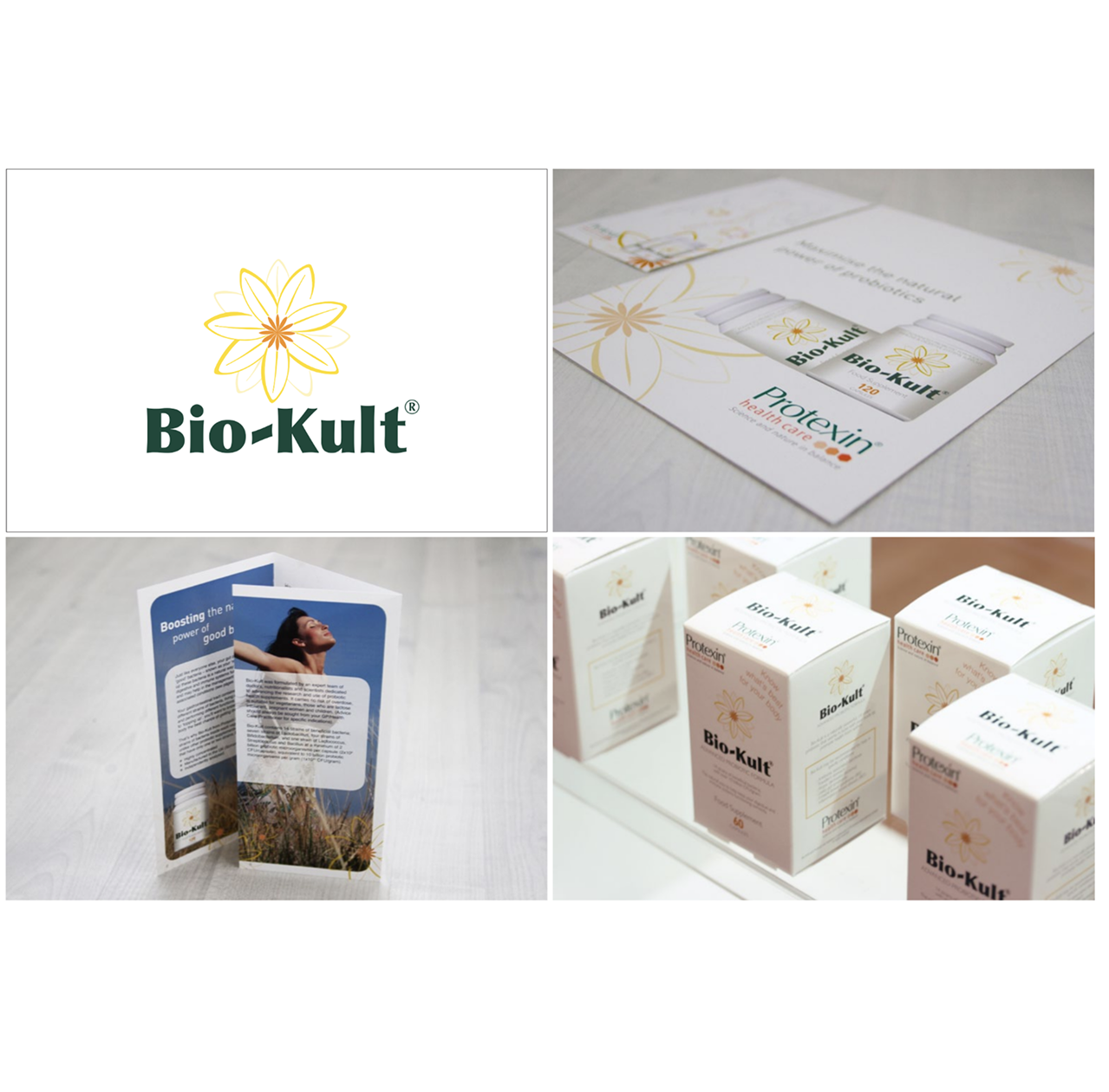
Feminine Flower Motif:
I developed a refined graphic interpretation of the Echinacea flower, utilising softer lines, gentle curves, and a more vibrant, natural color treatment to successfully infuse the required feminine touch while maintaining recognition.
2. Packaging Design Strategy
The new visual system was implemented across the entire product line to drive consumer recognition and shelf appeal.
Key Deliverable:
A cohesive packaging architecture that clearly communicates product benefits and the award-winning formulation, using the new color and graphic system to differentiate product variants effectively.
3. Brand Touchpoint Execution
To ensure a unified brand experience, I managed the application of the new identity across all physical and collateral materials.
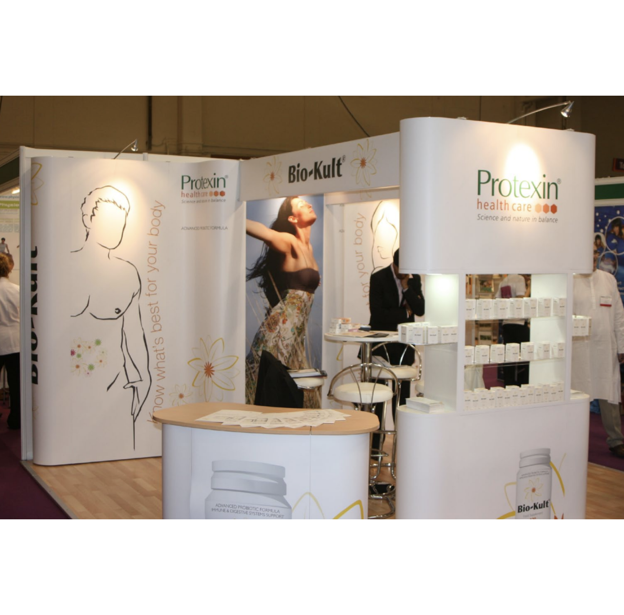
Exhibition Stands:
Designed engaging, spacious, and inviting exhibition booth concepts that incorporated the new visual language to attract visitors at industry events and trade shows.
Marketing Collateral:
Produced a full suite of materials, including brochures, point-of-sale displays, and digital assets, ensuring consistency in tone, color, and message across all communications.
BACK TO TOP
Back to top


27.4705° S 153.0260° E
bio kult
rebrand
rebrand
(©2021 — 2025)
Scroll Down


Bio-Kult: Elevating a Wellness Brand's Visual Identity
Repositioning Bio-Kult:
Feminising a Leading Gut Health Brand. led the creative effort to strategically reposition Bio-Kult, a multi-award-winning leader in gut health supplements, by transitioning its visual identity from a clinical, masculine aesthetic to a fresh, feminine, and consumer-friendly look.
The core challenge was achieving this transformation while preserving the brand's established equity, specifically evolving the crucial Echinacea flower motif. This project encompassed defining the new visual system and executing its flawless integration across key brand touchpoints, significantly enhancing market appeal and consumer connection.
(01)
rebrand
MORE
PROJECTS


let's talk,
design
