Exhibition Strategy and Design Impact
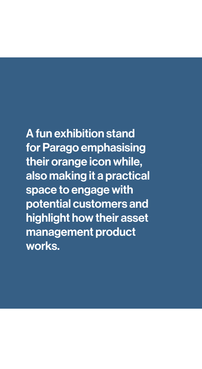
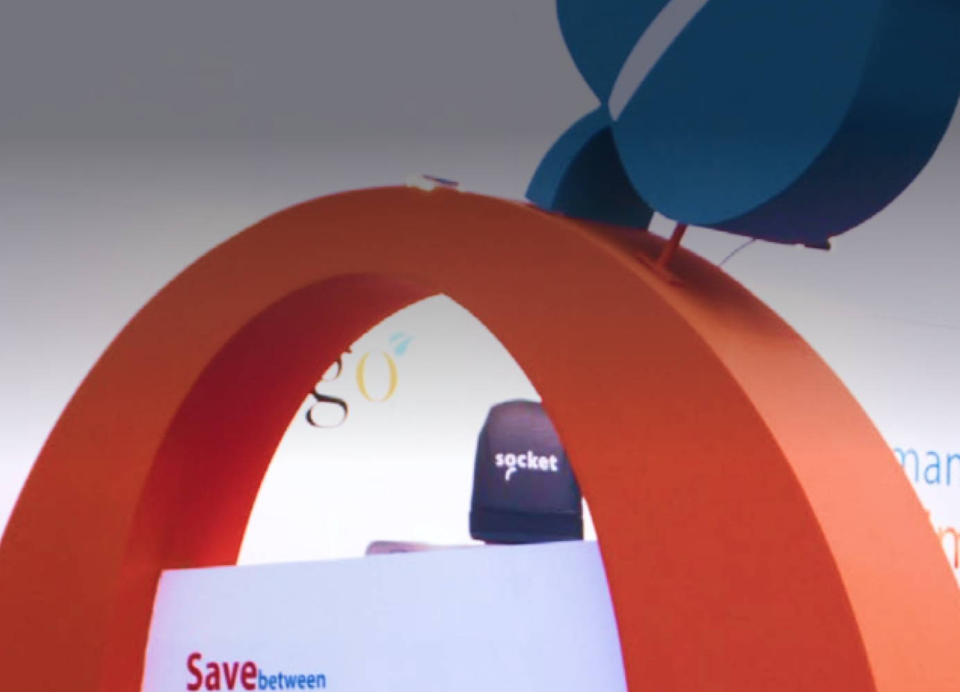
The key to achieving memorability was leveraging Parago's existing, yet underutilised, brand element: the memorable 'orange O' from their logo.
Brand Amplification:
I took the simple 'orange O' and transformed it into the central focus of the exhibition stand design.
Experiential Touchpoint:
The 'O' was enlarged into a giant, structural element and cleverly converted into a functional, branded meeting space on the stand. This creative intervention not only made the stand visually distinctive, ensuring it stood out against competitors. But also created a welcoming, practical area for client conversations, turning a static logo element into a dynamic, memorable physical touchpoint.
This project demonstrated the power of using core brand assets strategically to build an engaging physical experience, significantly improving brand presence and recall at key industry events.
BACK TO TOP
Back to top


27.4705° S 153.0260° E
parago
branding
BRANDING
(©2021 — 2025)
Scroll Down


Parago Software (Civica): Creating Memorable Brand Experiences
I partnered with Parago Software (now Civica), a leading provider of asset management solutions for schools, to design impactful marketing collateral and a standout exhibition stand. The core objective was to create a distinctive presence that would enhance brand recall and engagement.
(01)
BRAND AMPLIFICATION
MORE
PROJECTS


let's talk,
design
